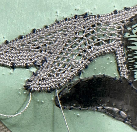
I am not happy with the way the two-toned effect worked out on the fingers. I think the distinct separation of the colors is too much and ultimately looks too cartoonish. Cutting off the threads is a little painful to do, but necessary sometimes. I carefully took off the offending threads, to start again.
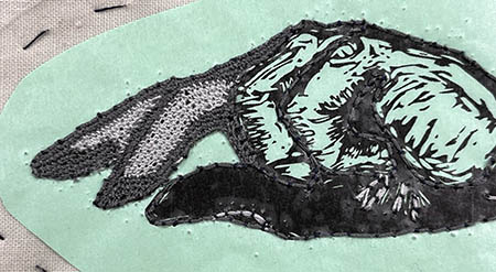
For the second go around, I used a single color and multiple stitches. The print of the fingers has light and dark areas. So, I used a dense stitch in the dark areas and open stitch in the light parts. I think it looks much better than trying to achieve the different tones with thread color.